This Tableau project analyzes a global dataset of over 51,000 records to identify key drivers of business performance. Through a series of interactive visualizations, the project explores the relationship between sales volume, profitability, and logistics costs across diverse regions.
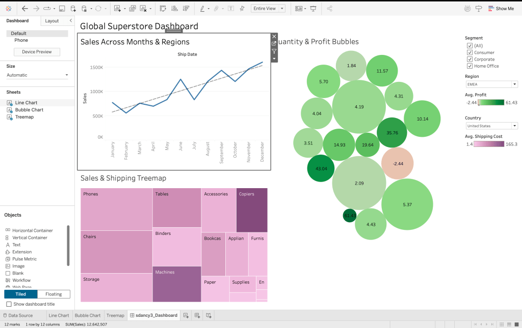
Click on the below options for a more detailed view:
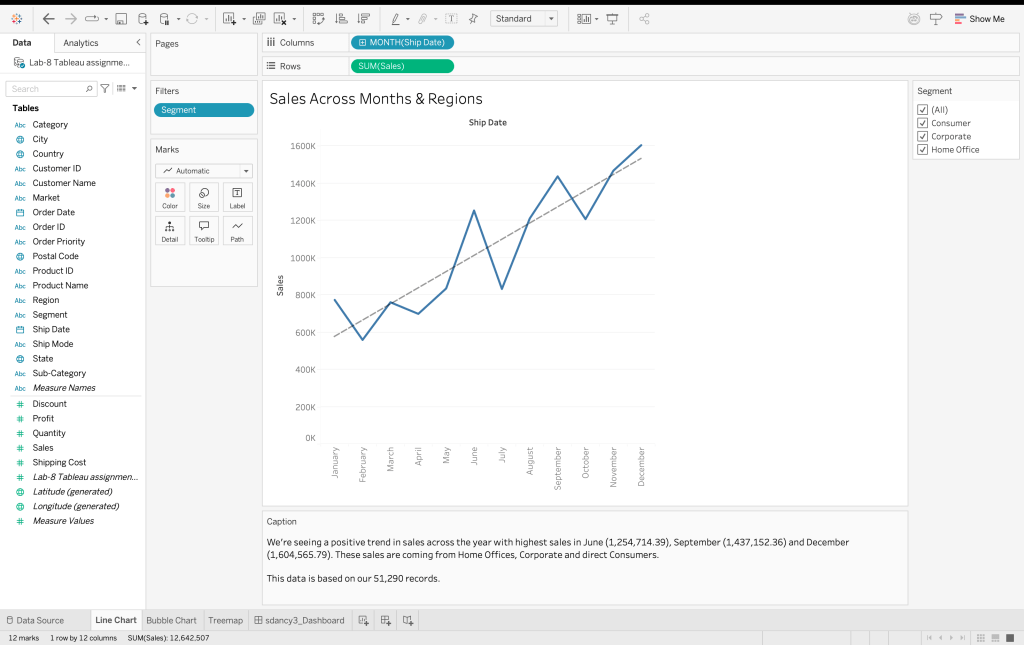
Time Series Analysis
Identified an upward sales trend with major revenue peaks in June, September, and December.
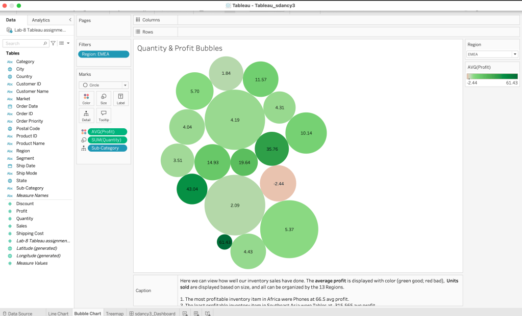
Profitability Auditing
Used multi-dimensional bubble charts to visualize the correlation between units sold and average profit across 13 regions.
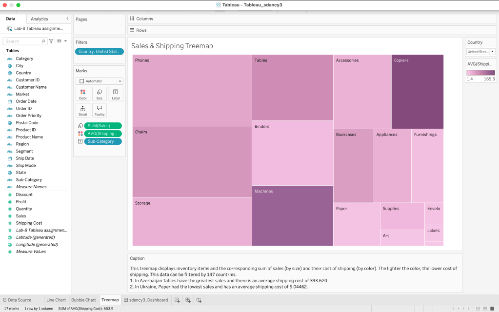
Logistics Optimization
Developed a treemap to analyze shipping overhead, pinpointing high-cost logistics areas relative to sales volume across 147 countries.
See other portfolio pages here:
Or, return to portfolio overview here: susannadancy.com/data
